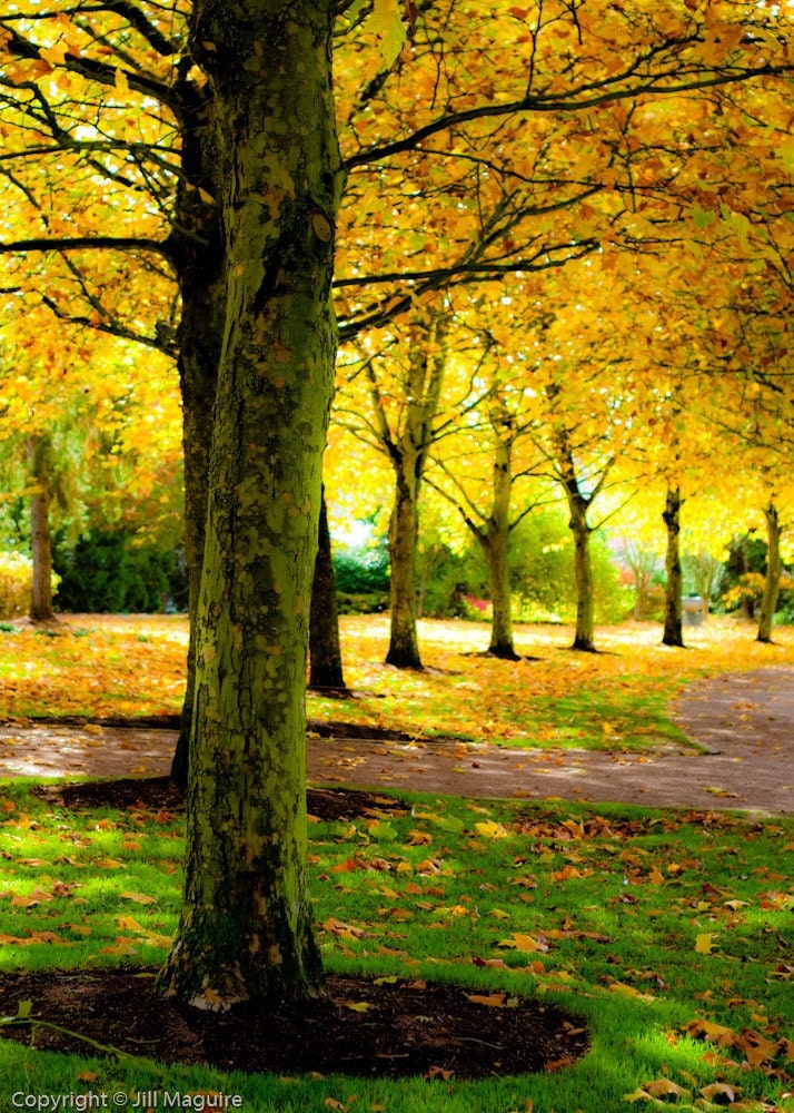
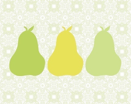
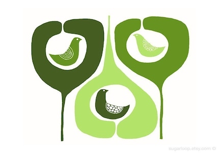
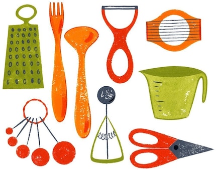
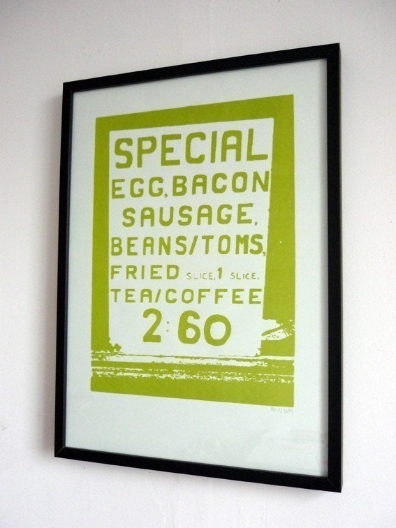
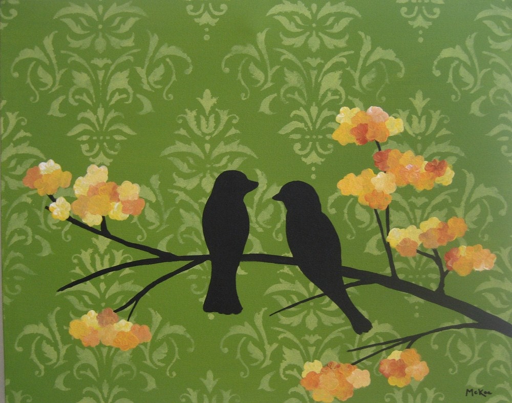
I have started looking around for some inspiration for my new art for the dining area of the kitchen. Here is what I have found so far. Click on the links below the photos to see where I found them:
So that's what I'm working with for now. I like the green and yellow on white theme. I'm still not sure how it will turn out, but it's a start!



2 comments:
kitchen drawer is probably my favorite. it's not surprising though, because that has a very retro mid century feel to it and I just can't stay away from those styles.
Holy cow, I just looked at your archives thingy and realized you've been posting on here for a while now. I had no idea! Anyway, way cute stuff Audge. I will be back fo shizzle.
Post a Comment